


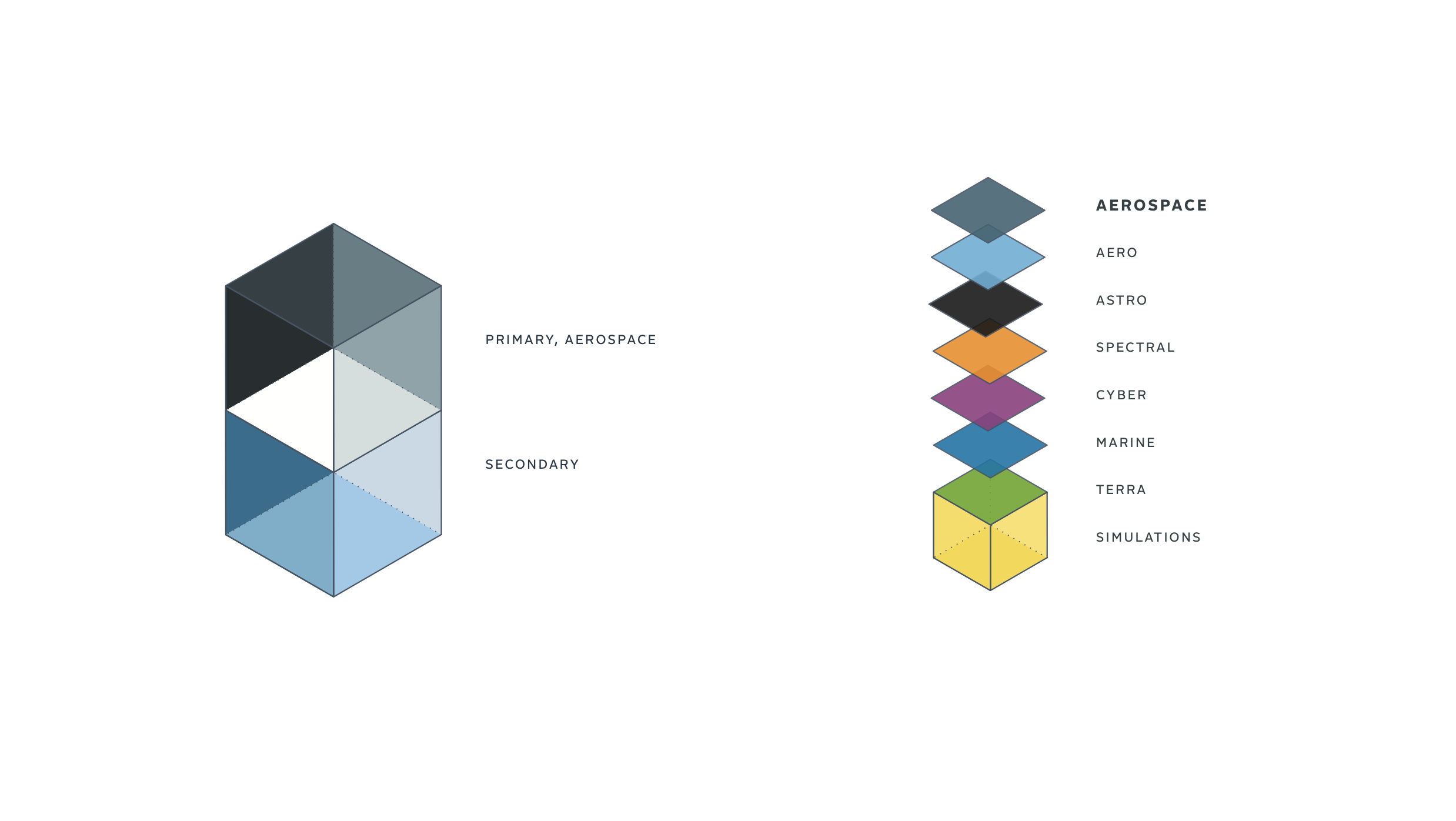


In the world of defense contractors, built on scare tactics that try to sell in separate pieces of an ultimate solution—Meta offers innovative, turnkey solutions they believe are more strategic, comprehensive options for worldwide issues. Branding here needed to communicate a very complex business while creating flexibility for including future military divisions beyond airborne.
Military forces with unmatched endurance, capable of quickly changing direction and speed that work well with and support each other are incredibly unique. And in high demand. Finding metaphorical inspiration in the Swift—true jaw-dropping aerial acrobats—the brand began to take shape as a company that mimics the birds’ remarkable abilities.
As lead designer, I managed all aspects of the creative direction from logo ideation through team presentation in London. We built out the brand including, typography, logo, color palette, super-graphic, collateral, brand guidelines, sales sheets and most importantly the logo brand system that was capable of flexing as the overarching brand grew.
It’s important to remember the trick here, was to quietly create a memorable presence for Meta while they build their multi-divisional company through government contracts and acquisition. Strategically differentiating them from the competition on this insanely complex journey.