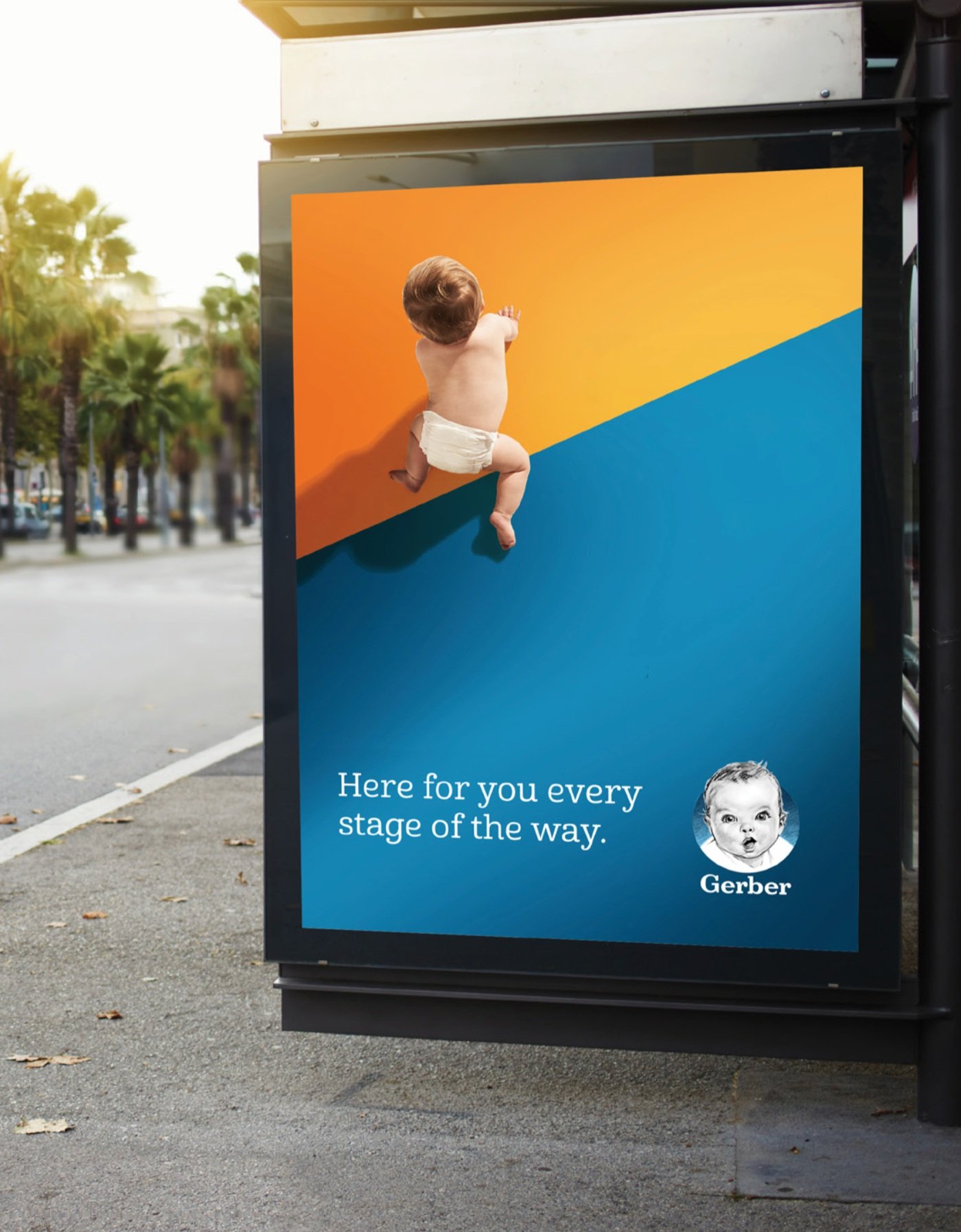


Faced with updating this 90-year-old international brand, while fending off a slew of hip, trendy indie labels competing for shelf-space was an incredible opportunity. Although Gerber exceeds benchmarks for quality, research shows smaller brands are perceived as healthier. To succeed, the packaging had a lot of heavy lifting to do.
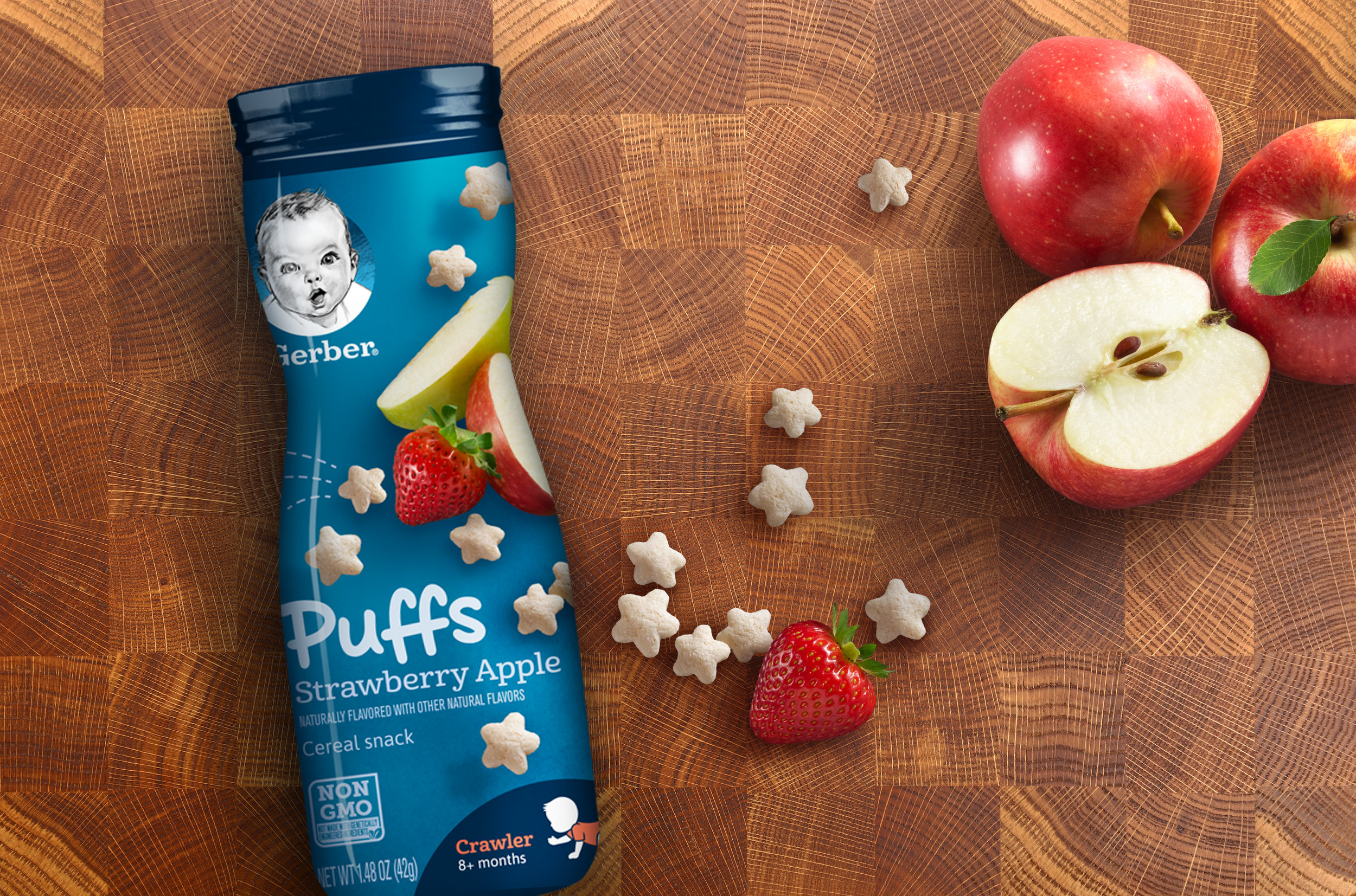
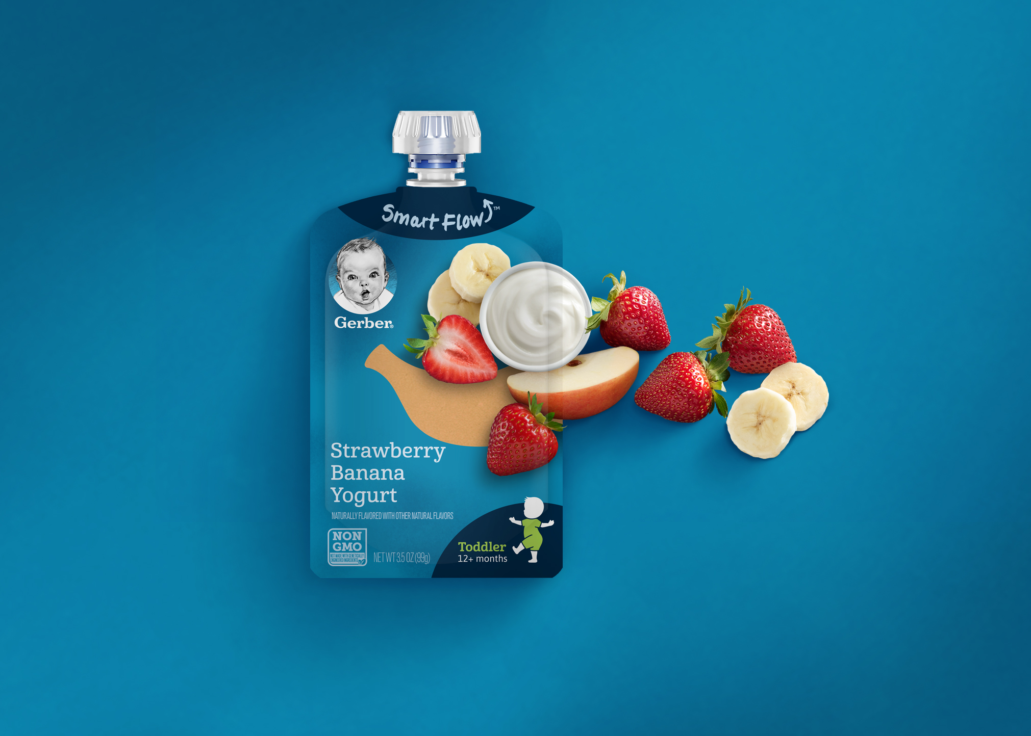
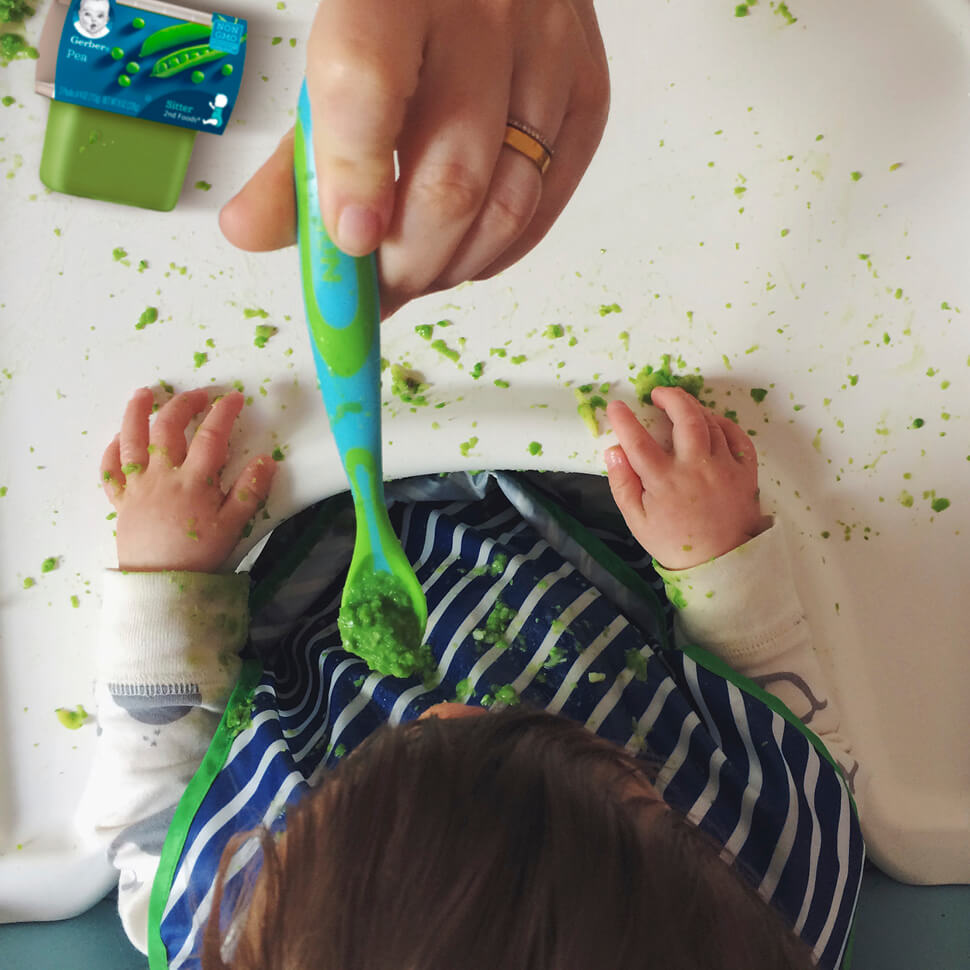
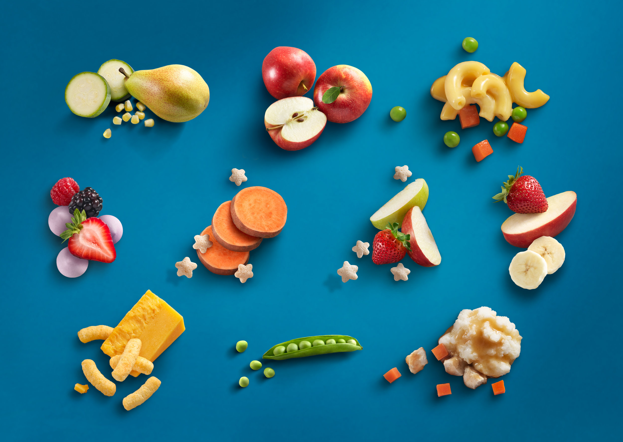
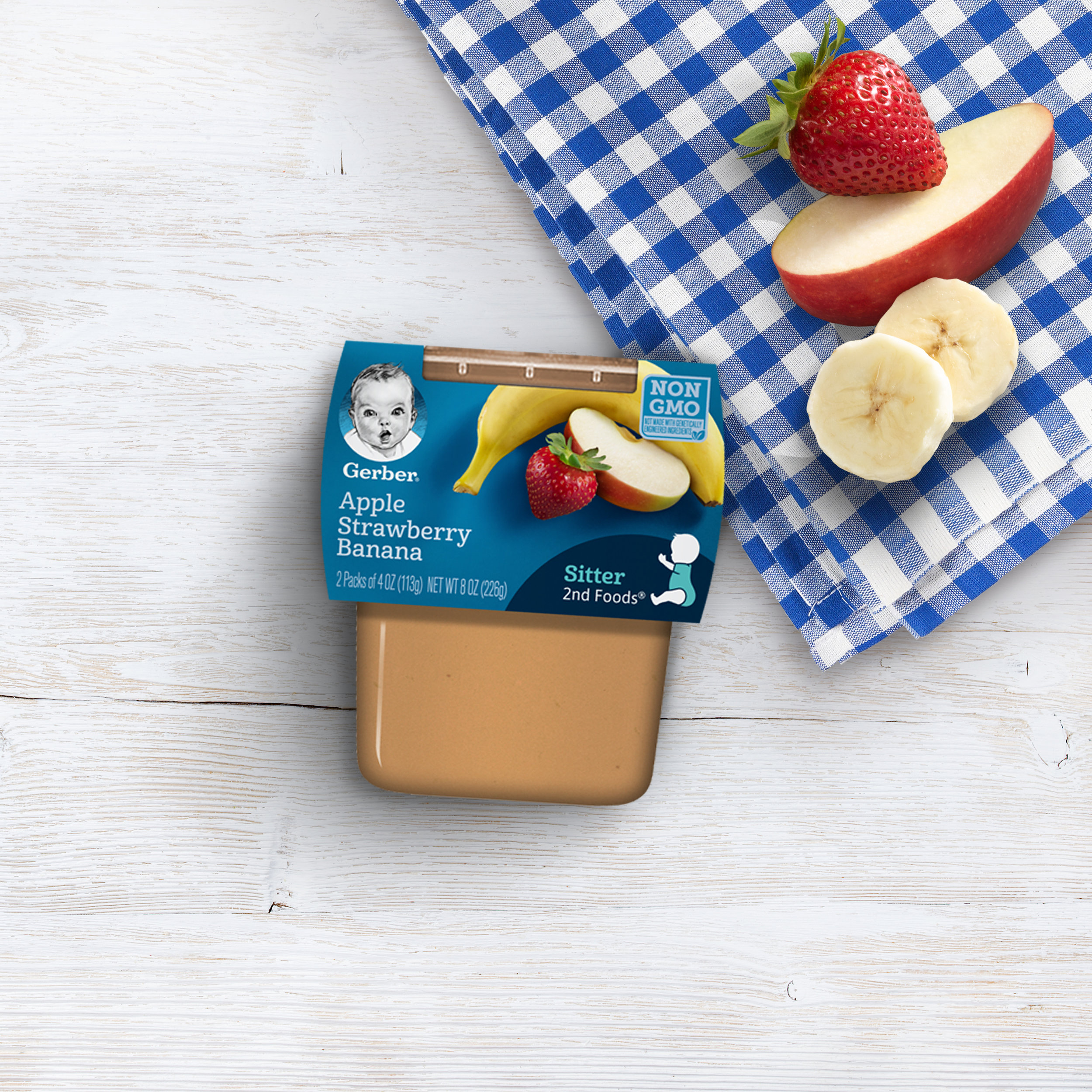
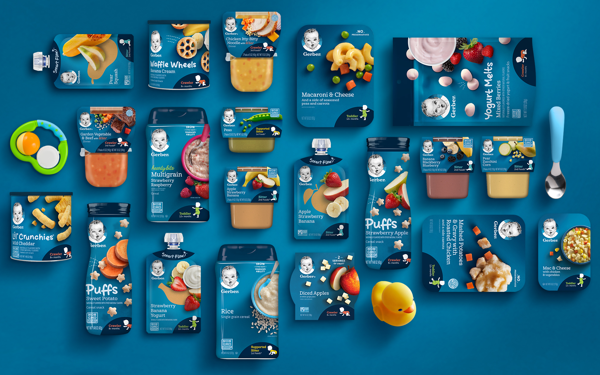
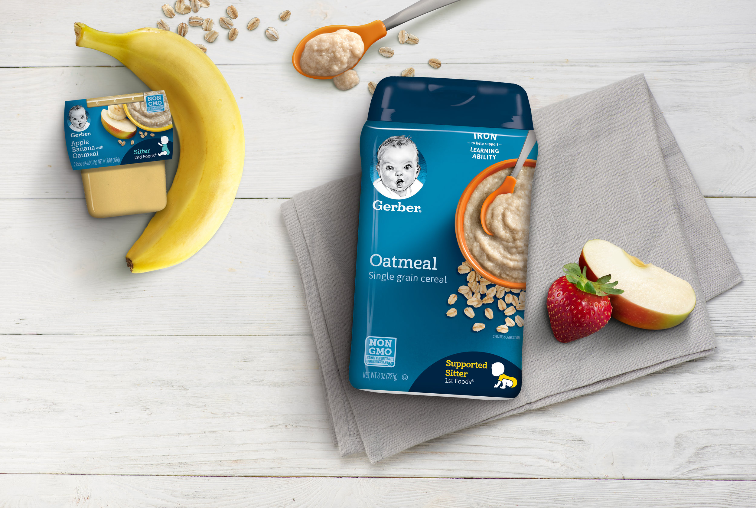
We live in the real world, not Pinterest. This work reflects what Moms know best—life’s messy and full of joy all at once. And it’s never artificially perfect. As the lead designer, I designated the realistic photography style, the bold, natural colors as well as lent a hand in writing both the US and International style guides for over 300 SKUs.
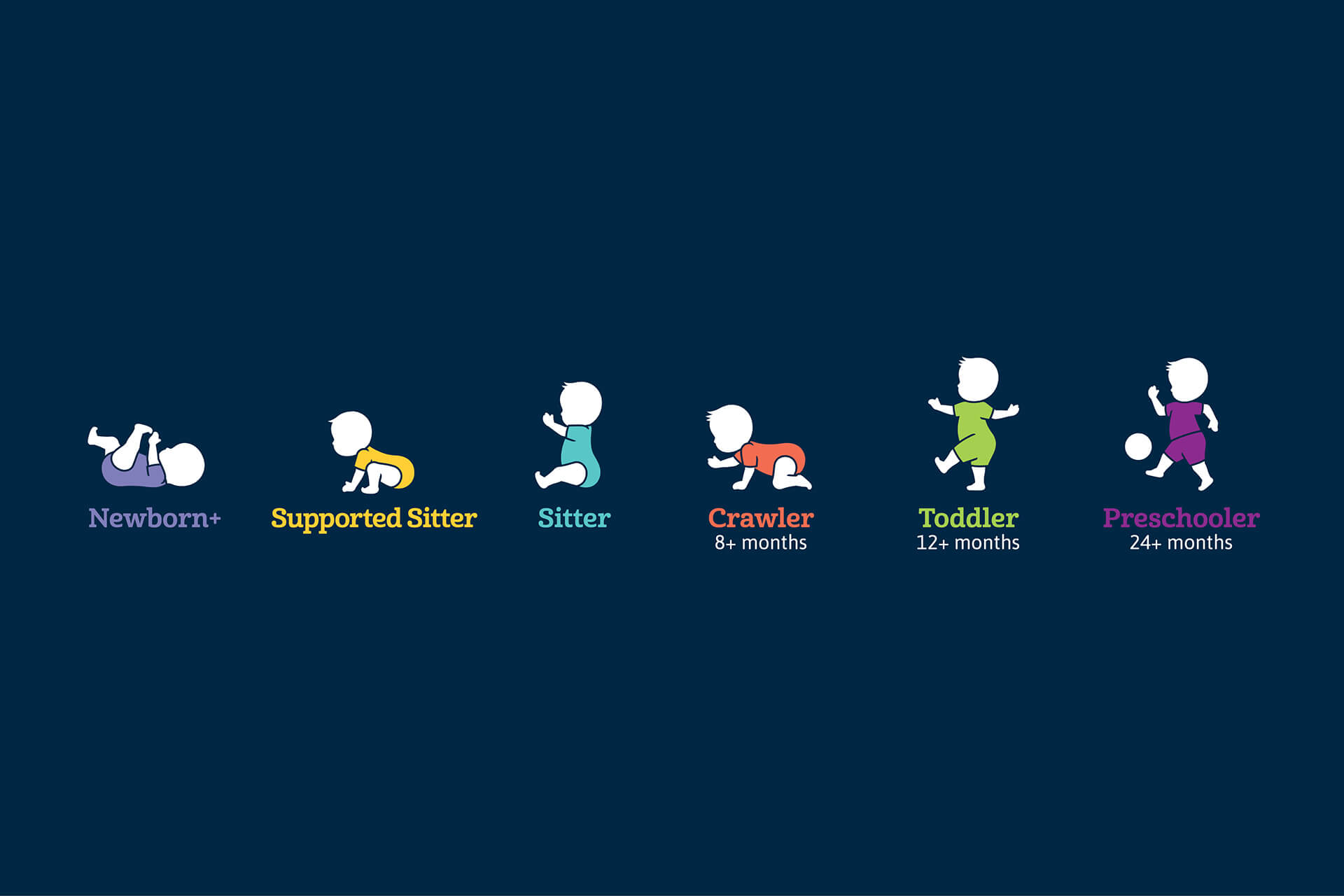
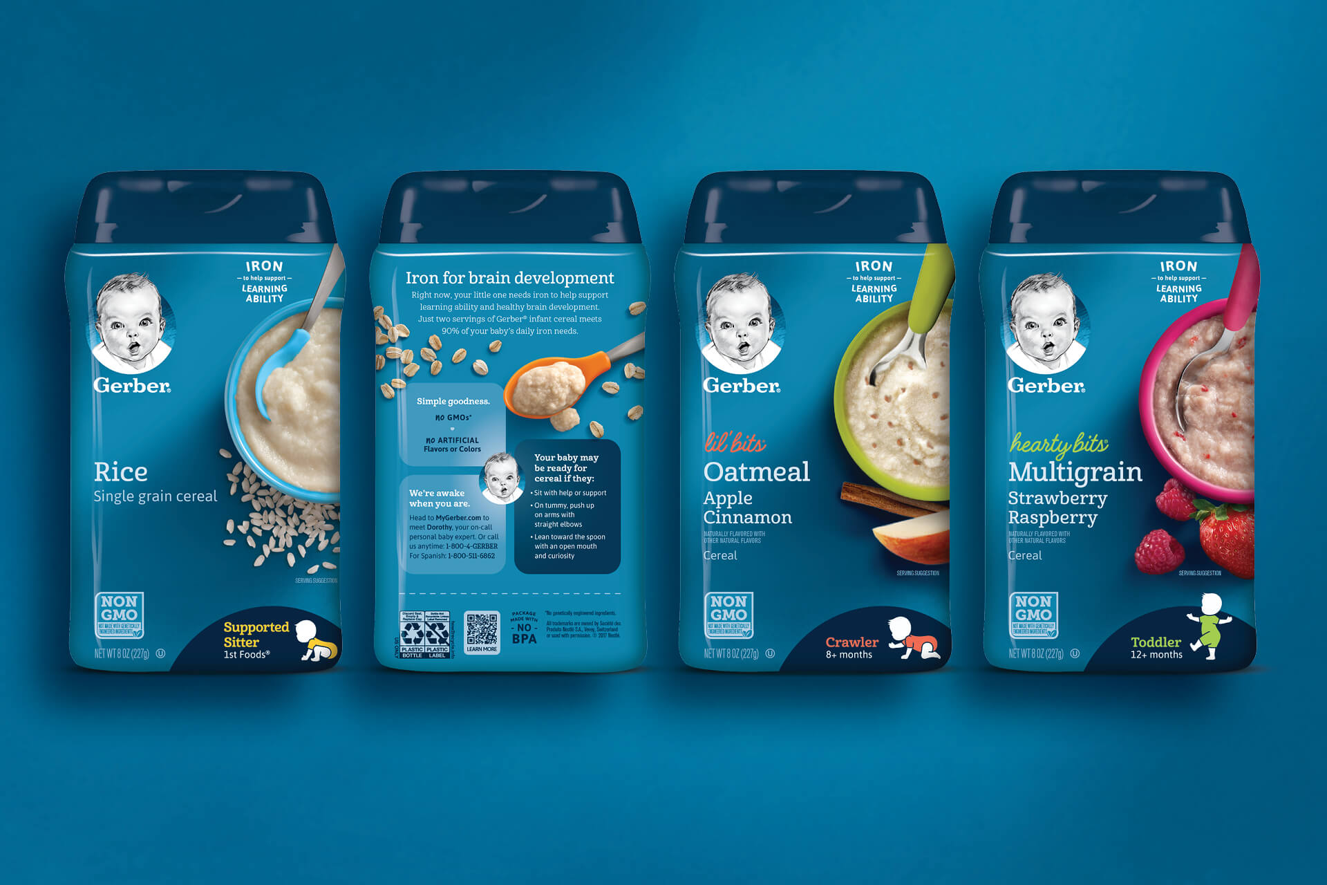
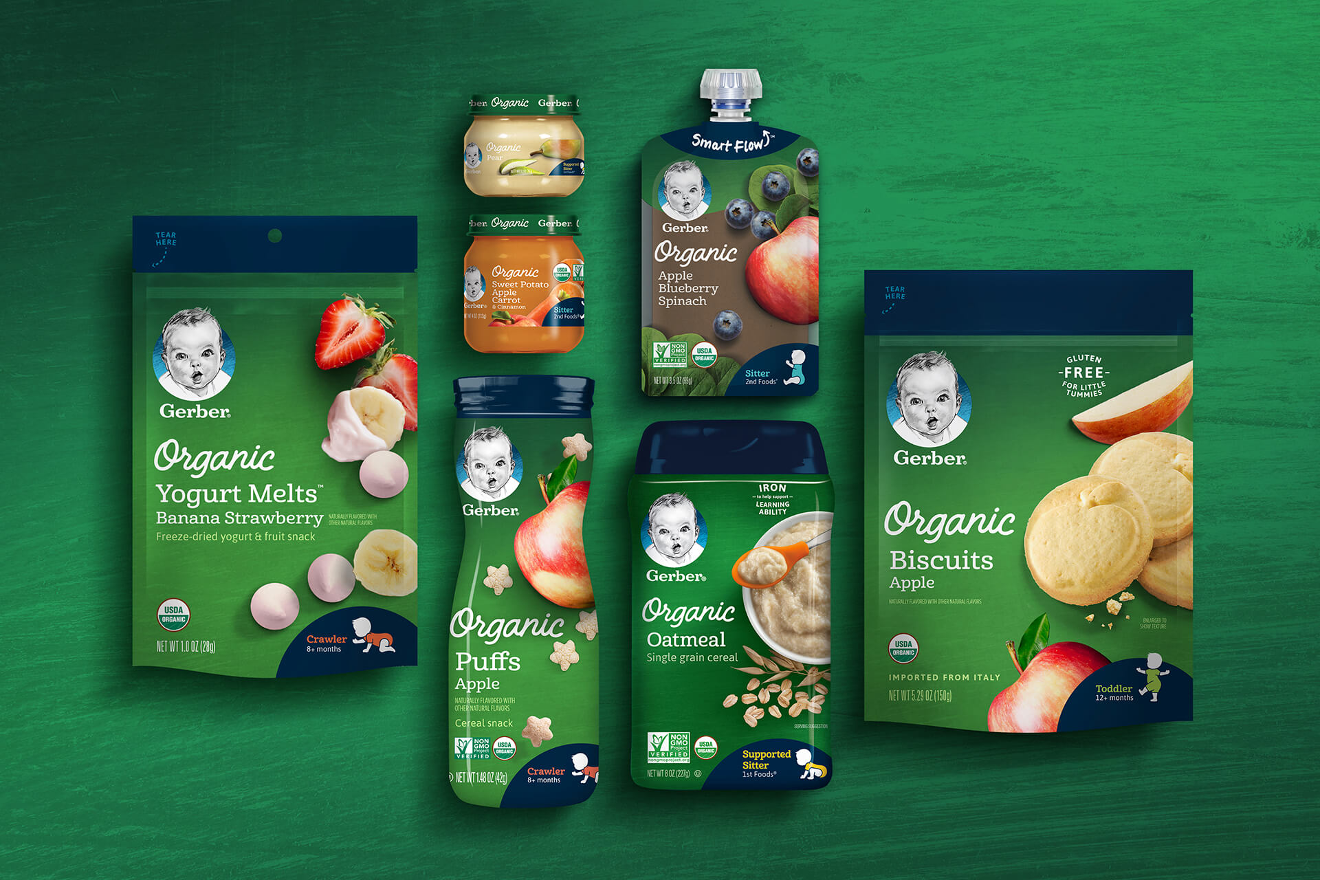
Across all categories, Moms are overwhelmed with choices and opinions. We created a consistent, easy to shop packaging system (complete with way-finding) that made it easier to quickly find the right stage food for babies—from infant cereal, puree, snacks and meals to supplements and innovation products. As well as served up crisp, easily digestible nutritional info.
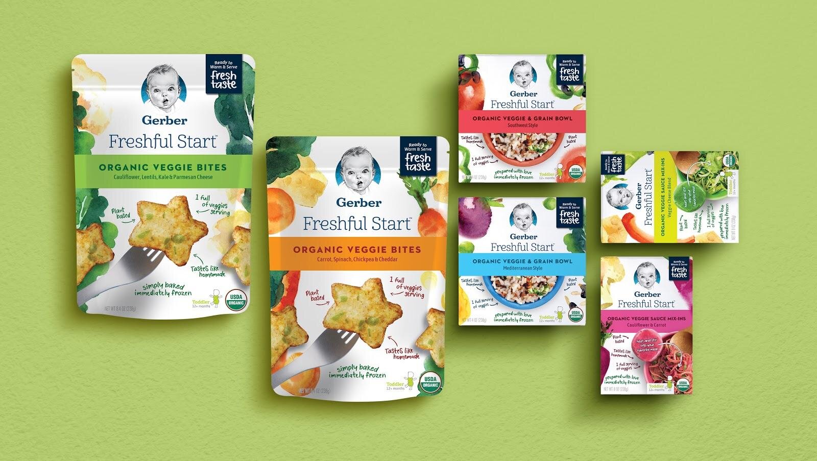
The success of this massive rebrand gave way to Nestle extending the new look and feel to cover their Organic line of baby offerings internationally. Happily, it lead to more packaging work for some of their other brands, too.